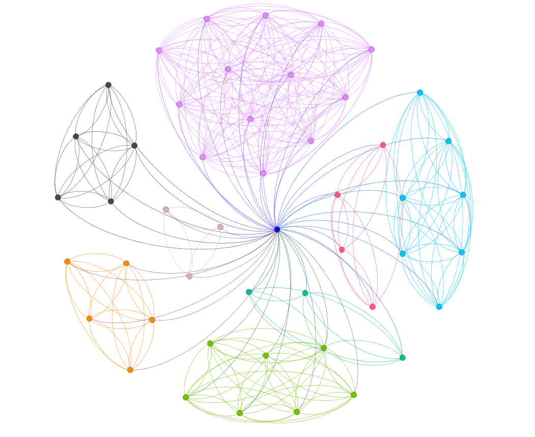

Looks kind of like a pseudo 3-D cluster analysis diagram.
Of course, it could be a 2D slice of same.
It is a 2d cluster analysis diagram, basically.
What’s really cool is you can select in the UI a different mapping algorithm, which will give you an entirely different view. Snowflakes don’t mean that it’s snowing.
I’m hip. There a number of layouts and stats.